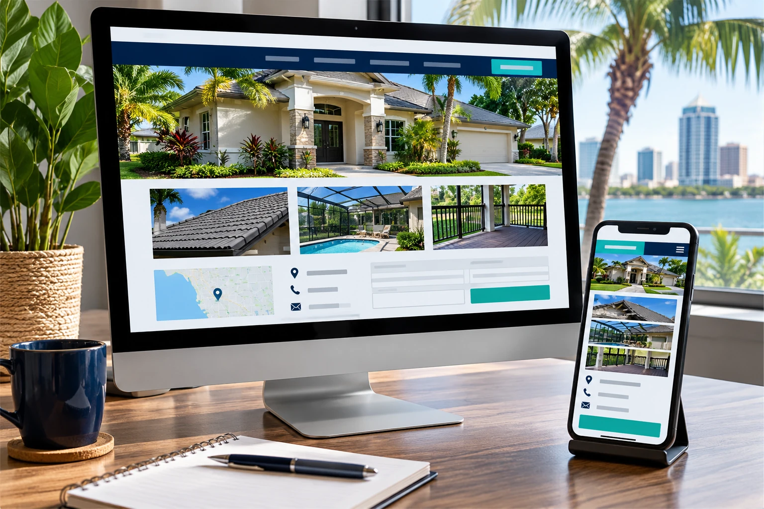
A homeowner in Tampa needs a roofer after a summer storm. She searches from her phone, opens two websites and tries to request an estimate. One site shows the services, service area and contact form right away. The other makes her hunt through a slideshow and a crowded menu. She has no reason to keep looking.
Florida businesses face this kind of decision every day. A website needs to answer practical questions before a visitor makes a call, sends a form or leaves. For contractors, retailers and professional firms, five elements deserve attention. None requires a flashy animation or a complicated home page.
1. A Clear Explanation of What You Do and Where You Work
Your first screen should identify the service, the customer and the area you cover. “Reliable Solutions for Every Need” will not tell someone whether you repair roofs, clean pools or prepare tax returns. “Residential and Commercial Roofing in Tampa Bay” will.
Put the service information in readable text. Give your primary pages descriptive headings and use navigation labels that people recognize. A visitor should be able to find the services page, examples of previous work and contact details without guessing.
A well-planned custom website design starts with what a customer needs to understand. IMS organized the New Era Roofing website around residential and commercial services, West Central Florida coverage and estimate requests. Those are the questions a roofing customer is likely to bring to the site.
For a business with multiple legitimate service locations, publish accurate coverage details. A service area hub can help people navigate local pages when each one contains information worth reading. Swapping city names into an identical paragraph does little for the customer.
2. A Mobile Layout That Loads and Works Properly
Your website has to function on the phone a customer is holding. Check the menu, image sizes, contact buttons and form fields on an actual device. A desktop screenshot cannot reveal every mobile problem.
Google uses the mobile version of website content for indexing and ranking. That makes it important to keep useful text and important links available on mobile, rather than hiding them behind a separate incomplete layout.
Speed is measurable. Google recommends a Largest Contentful Paint of 2.5 seconds or less, an Interaction to Next Paint below 200 milliseconds and a Cumulative Layout Shift below 0.1 for a good Core Web Vitals experience. These are user-experience targets, not a promise of higher rankings.
Use PageSpeed Insights and Search Console to identify the pages with problems. Compress large photographs without losing important detail, avoid loading unnecessary scripts and reserve image space so the page does not jump while people read. An oversized homepage video can look impressive on a fast office connection and become an obstacle on mobile data.
If you already have a site, a focused website redesign may resolve those issues without discarding working content and URLs.
3. Service Pages and Search Information That Match Real Customer Needs
One generic “Services” paragraph rarely answers enough questions. A pool company may need separate information about weekly maintenance, equipment repairs and resurfacing. A law firm may need clear distinctions between practice areas. Write each page around the work the company performs.
Describe what is included, who the service is for, the general process and how to get started. Link to related pages where that helps a visitor. Give each page a descriptive title, readable headings and an address that makes sense.
Google’s SEO Starter Guide recommends a logical site structure, descriptive URLs and links people and search engines can follow. Its Search Essentials also emphasize helpful content and crawlable links. These are foundations of search engine optimization, not shortcuts for guaranteed placement.
The Ryan The Tampa Handyman case study shows an approach organized around local handyman services and coverage areas. A visitor interested in a specific repair benefits from finding the relevant service rather than reading the same general advertising copy on every page.
Keep business information accurate, especially your phone number, contact route and areas served. If your company has a Google Business Profile, make sure its categories and service details reflect what the business offers.
4. Proof of Work That Helps Customers Judge Your Experience
Visitors need more than a claim about quality. A contractor can show completed jobs. A designer can explain the pages and functionality delivered. A professional association can demonstrate the information and systems available to its members.
Use original photos with permission, truthful project descriptions and customer reviews that reflect genuine experiences. Say what the project involved. If you have measured a result, name the measurement and the period. Do not invent traffic increases or sales figures to make a case study sound stronger.
Consider the Florida Association of School Social Workers project. It documents website and association-platform work, giving potential clients an example of the type of development IMS handles.
Keep your portfolio accessible from relevant service pages, then connect individual examples back to those services. Someone evaluating a website designer may want to see a similar business project before making contact.
5. A Simple Path From Interest to Contact
A customer should never have to search for a working phone number. Show a clear contact option near the top of important service pages. Include another natural contact opportunity after the details a customer needs to make a decision.
On mobile, make phone numbers tappable. Keep forms short enough for their purpose, label each field clearly and confirm when a submission succeeds. Test the entire process yourself. A form that looks correct but never delivers a message is a serious business problem.
Use precise calls to action. “Request a Roofing Estimate” identifies the next action better than a vague “Discover More” button. A store needs an understandable checkout and purchase path. An association may need an obvious membership login or registration link.
The FASSW project illustrates why a website’s functionality should follow what its visitors need to accomplish. Information pages, member-related tasks and navigation must work together.
Before publishing, send a test inquiry from a phone. Verify the notification reaches the right inbox and that someone can respond. Repeat this check after major theme or plugin changes.
A Practical Review Before You Spend Money on Another Redesign
Open five important pages on your phone: the homepage, your primary service, a related service, a project example and contact. Try to find a service, understand its coverage, review previous work and submit an inquiry. Write down exactly where the process slows down or fails.
- Check that your main heading names the service and market in plain language.
- Confirm mobile menus, buttons and forms work with a finger.
- Review load speed and layout stability on representative pages.
- Make service pages distinct and connect them to relevant projects.
- Test that calls and form submissions reach your business.
Fix the faults that prevent customers from understanding or contacting your business before spending money on another visual overhaul. If your current website needs a structural review, contact Innovative Marketing Solutions to discuss the pages and functions that need attention.